Resume
At a Glance
Side Biscuit
Turning a local favorite into a digital experience that builds trust, expresses personality, and makes ordering feel effortless.
Context
Role
Product Designer - Brand Experience
Timeline
8 weeks
Platform
Responsive marketing website (Square)
Side Biscuit began as a small Instagram-based pre-order business during the pandemic, quickly earning a loyal local following through its inventive chicken wing flavors and scratch-made biscuits. As demand grew, the business opened a permanent storefront in Ann Arbor, transforming from a social media pop-up into one of the city's recognizable local restaurants.
However, while the restaurant had evolved, its website had not. Built on Square's website platform, the site functioned primarily as an online storefront, but it failed to communicate the personality, quality, and creativity that customers experienced in person. New visitors had little reason to understand what made Side Biscuit different—or why they should order directly instead of through third-party delivery platforms.
Our team partnered with Side Biscuit to redesign the experience while working within the technical constraints of Square. Rather than treating the project as a visual refresh, we focused on translating the restaurant's distinctive identity into a clearer digital experience that built trust, celebrated its unique brand, and guided customers confidently toward direct ordering.
My Contribution
While this was a collaborative team project, I primarily led the redesign of the Sauces experience and helped shape the website's overall visual direction. I focused on translating Side Biscuit's energetic personality into a digital experience by designing a more expressive visual system, crafting the sauce exploration page, and ensuring the brand felt as memorable online as it did in person. Throughout the project, I collaborated closely with teammates on research, design critiques, and maintaining a cohesive experience across the site.
Why It Matters
For local restaurants, a website is often the first interaction customers have with the brand. Before tasting the food or stepping inside the restaurant, visitors use the website to decide whether the business feels credible, memorable, and worth ordering from. If that first impression doesn't inspire confidence, customers are more likely to abandon the experience or default to third-party delivery platforms.
For Side Biscuit, this challenge was especially important. The restaurant had already built a loyal following through its bold flavors and distinctive personality, but its website didn't communicate those same qualities. The opportunity wasn't simply to modernize the interface—it was to bridge the gap between the vibrant in-person experience and the digital one, helping first-time visitors quickly understand what made Side Biscuit unique and feel confident ordering directly.
Design Opportunity
Transform a generic online storefront into a digital experience that builds trust, expresses Side Biscuit's personality, and makes ordering directly feel like the obvious choice.
Understanding the Brand
Turning Side Biscuit's personality into a system
Side Biscuit already had a distinctive character rooted in bold flavors, local identity, and game-day culture. Rather than creating a visual style independently from the experience, we translated those qualities into a lightweight visual system that could be applied consistently across the site.
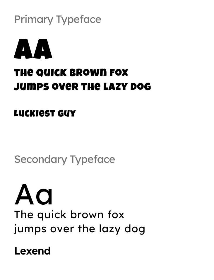
We established a bold navy and maize palette paired with expressive display typography and a more approachable secondary typeface. Together, these choices gave the website the energy and personality of the restaurant while creating enough structure and hierarchy to keep the experience easy to navigate.
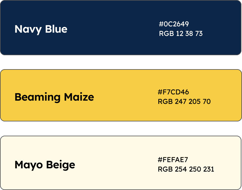
Color
Typography
Translating Brand into Experience
Show Customers Why They Should Order
The original experience led visitors toward ordering before giving them a strong sense of what made Side Biscuit worth trying. For first-time customers, there was little opportunity to understand the restaurant's bold flavors, rotating sauces, and personality before being asked to take action.
We flipped that relationship in the redesign. Instead of leading with an order button, the experience first shows customers what Side Biscuit has to offer—from its signature food and rotating sauces to the process and personality behind the brand. A dynamic carousel and expressive visual storytelling create appetite and curiosity before presenting the opportunity to order.
The result is a more intentional journey: discover → understand → get excited → order.


Before
After
Make Ordering the Obvious Next Step
Side Biscuit wanted to encourage customers to order directly rather than through third-party delivery platforms. We strengthened the experience with prominent, clearly labeled “Order Now” calls to action, giving customers an immediate path from exploring the restaurant to placing an order.
Rather than letting ordering compete with the rest of the site's content, the redesign makes the primary action visually prominent and consistently accessible throughout the experience. This creates a clearer connection between discovering the brand and taking action.


Before
After
Build Trust Through Storytelling
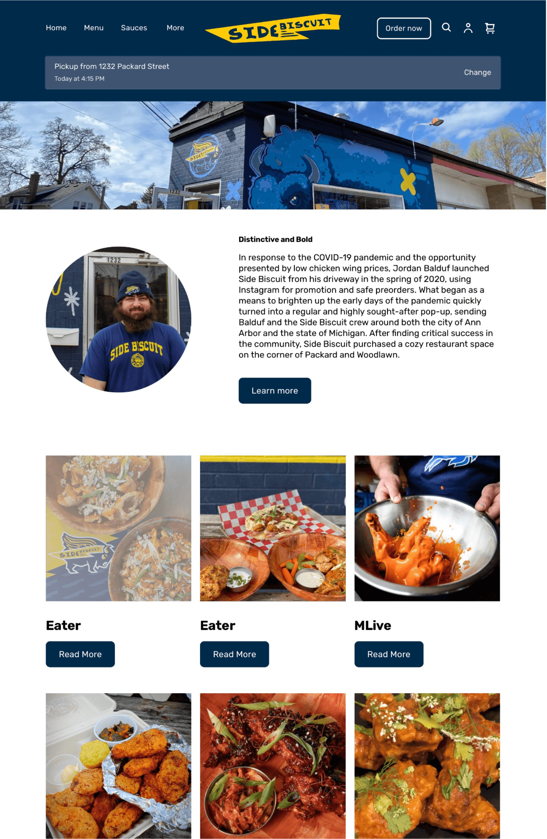
For a local restaurant, trust can be the difference between browsing and ordering. We used the About page to tell Side Biscuit's story while highlighting its growing reputation through press coverage and accolades. By combining the restaurant's origin story with evidence of its success, the experience gives first-time visitors both a reason to care and a reason to believe.
This creates a narrative that moves from who Side Biscuit is → what they've accomplished → why customers should trust them, turning the About page into more than background information—it becomes a tool for building credibility.

Before
After
Celebrate What Makes Side Biscuit Different
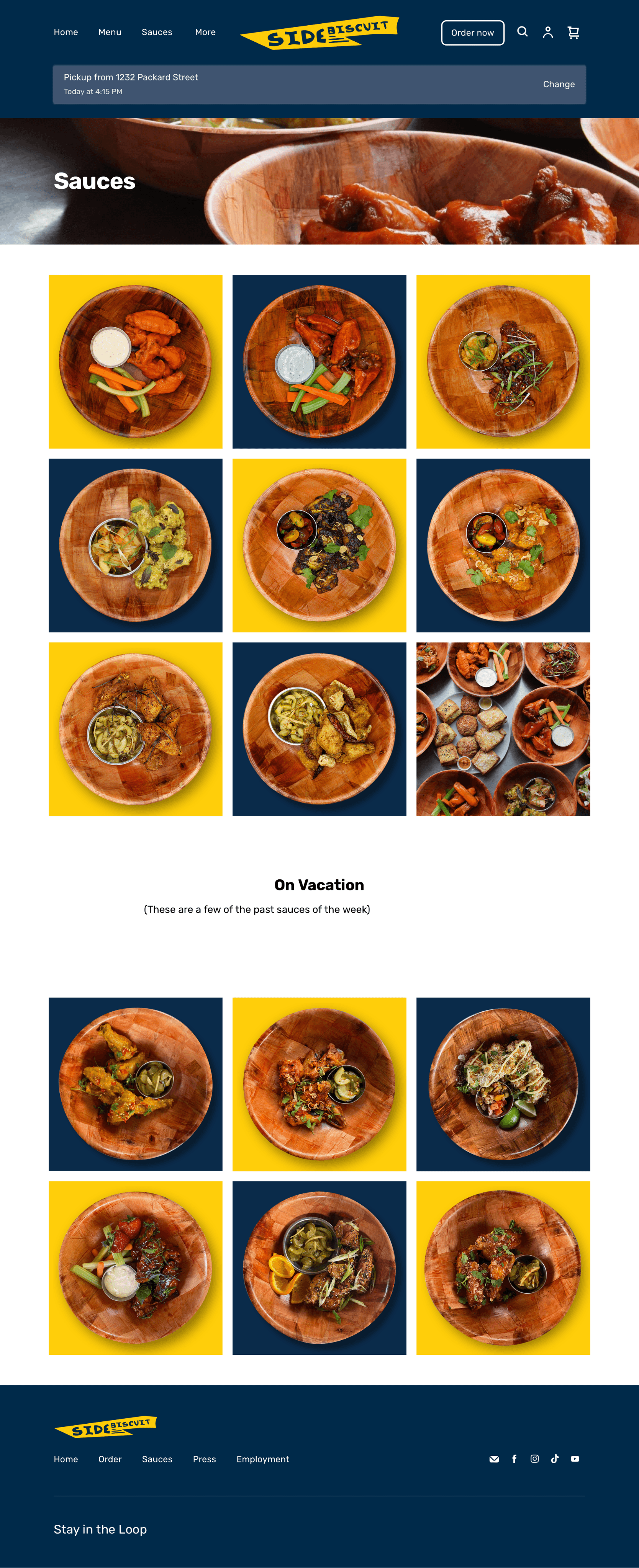
The sauces are Side Biscuit's signature differentiator, yet the original website treated them as supporting information. I redesigned this experience to make exploring flavors feel as engaging as ordering them, transforming a simple menu into an extension of the restaurant's personality.
Inspired by sports lineups and the energy of game-day culture, each sauce was presented as a featured player, complete with expressive names, flavor descriptions, dietary indicators, and rotating weekly specials. Rather than overwhelming visitors with information, the page organizes each flavor into a scannable system that makes comparing options quick, enjoyable, and memorable.

Before
After
Impact
Designing a clearer path from discovery to decision
The redesign transformed Side Biscuit's website from a functional online storefront into a more expressive digital extension of the brand. By clarifying the information hierarchy, elevating the restaurant's signature sauces, strengthening calls to action, and introducing a more cohesive visual identity, we created an experience that better communicates what makes Side Biscuit different and guides customers toward ordering.
Most importantly, the redesign connected brand expression with business goals. Instead of treating personality and usability as separate concerns, we used the brand itself to help customers understand the product, build confidence in the restaurant, and move naturally toward action.
Before
Generic digital storefront
Key offerings were easy to overlook
Ordering competed with other content
Website felt disconnected from the restaurant
After
Distinctive brand experience
Signature sauces became a focal point
Clearer paths to direct ordering
Digital experience reflected Side Biscuit's personality
Reflection
Designing for personality is still designing for clarity
This project reinforced that thoughtful visual design can do more than make an experience feel distinctive. It can help people understand it.
Working within Square's constraints challenged me to think beyond what I would ideally build and focus on how to communicate the right information with the tools available. Designing the sauces experience was especially valuable because it required translating something inherently expressive and constantly changing into a system that was still easy to scan, understand, and navigate.
I came away with a stronger appreciation for the relationship between brand, usability, and trust. When those elements work together, visual design isn't decoration. It becomes a way of helping people recognize what matters, understand their options, and confidently decide what to do next.
Moral of the Story
The best brand experiences don't just tell people who you are. They make it easier for people to understand why you matter.
Full case study in progress